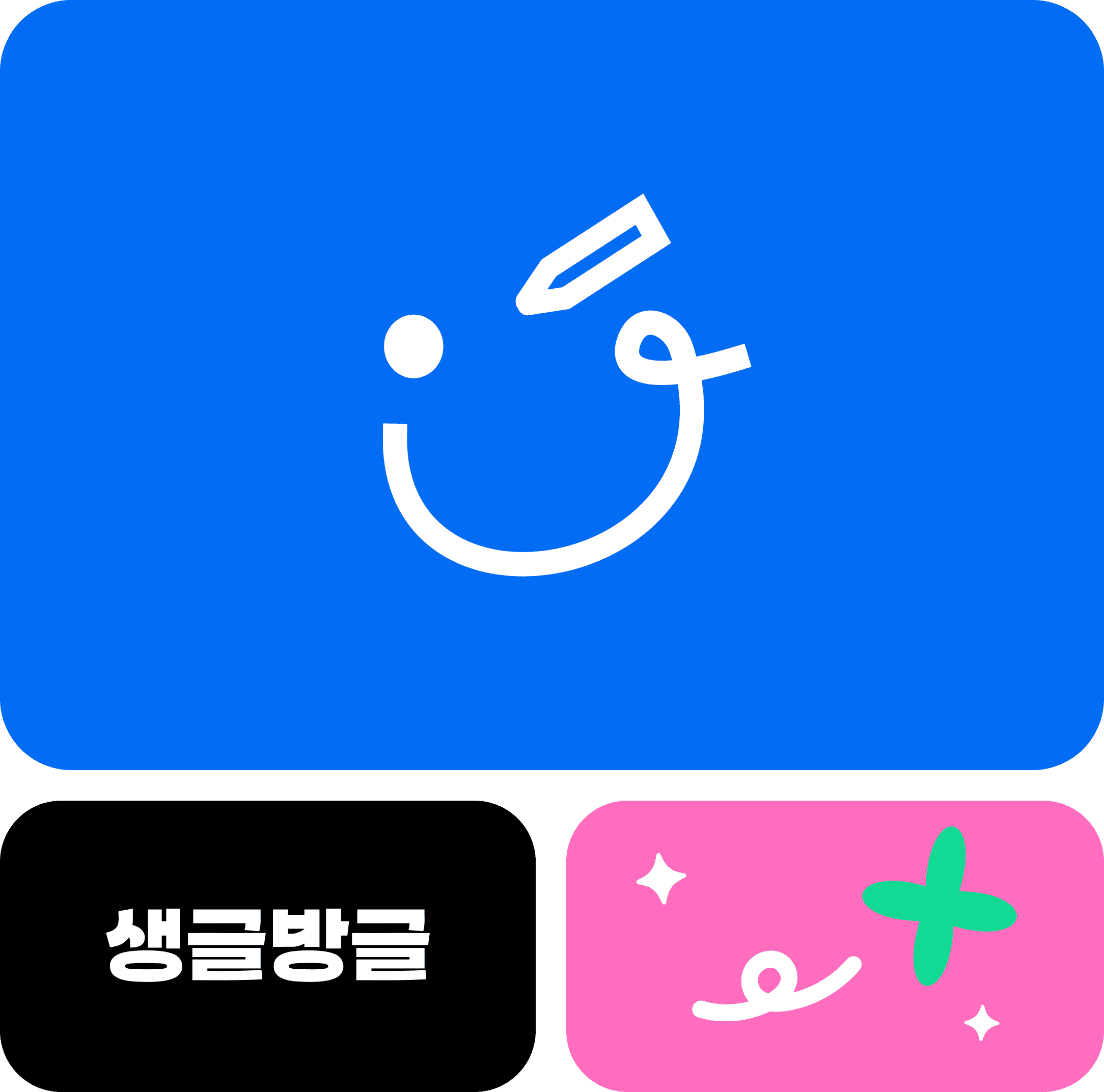
smilewriting
website
SMILEWRITING
WEBSITE
SMILEWRITING
WEBSITE
SMILEWRITING
WEBSITE
SMILEWRITING
strategy
Web Design
Responsive Design
Mobile Optimization
SEO Setup
생글방글은 AI 기반 실시간 글쓰기 첨삭 서비스를 제공하는 에듀테크 브랜드입니다. 기존 웹사이트는 콘텐츠가 단순히 나열된 구조로 되어 있어 방문자가 브랜드의 핵심 서비스와 방향성을 직관적으로 이해하기 어려웠습니다. 이로 인해 실제 서비스 신청으로 이어지는 전환 흐름이 원활하지 않은 문제가 있었습니다. 이에 따라 생글방글의 주력 서비스인 ‘실시간 첨삭 AI 글쓰기 교실’을 중심으로 웹사이트 전체 구조를 재설계하는 리뉴얼 프로젝트를 진행하였으며, 본 프로젝트를 통해 브랜드의 전문성과 신뢰도를 효과적으로 전달하고, 궁극적으로 서비스 전환율을 높이는 플랫폼을 구축하고자 했습니다.
SMILEWRITING is an edtech brand offering AI-powered real-time writing feedback. The old website lacked structure, making it hard for users to understand the core service or take action. We rebuilt the site around “Real-Time AI Writing Feedback Classroom” to clarify the brand’s focus. The new design leads users smoothly from interest to sign-up. This renewal strengthened brand trust and boosted service conversion through a user-centered experience.

main page
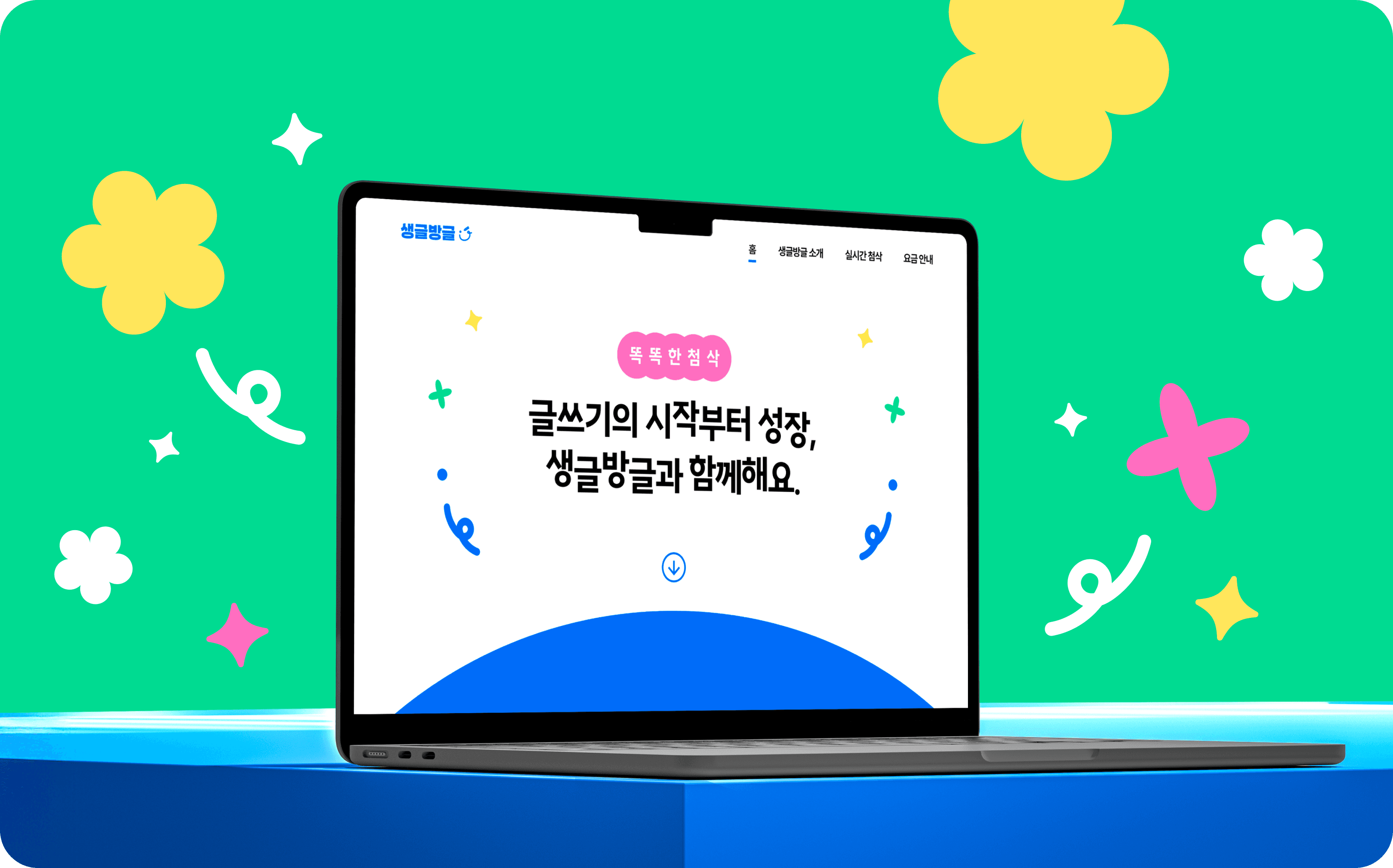
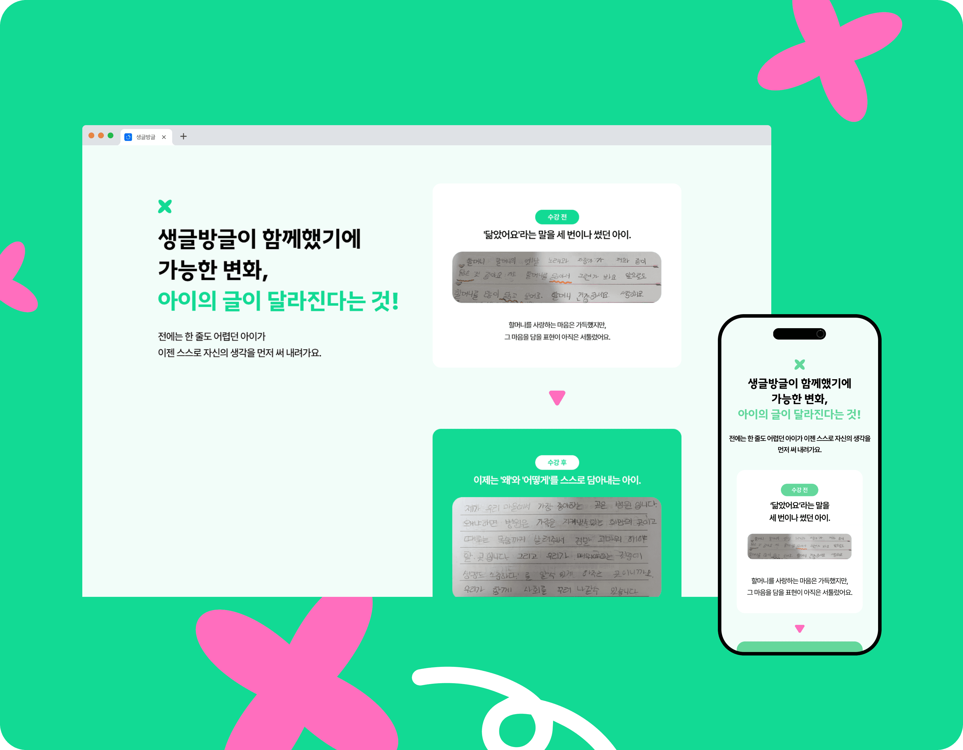
메인 페이지는 방문자가 핵심 서비스인 ‘실시간 첨삭 AI 글쓰기 교실’을 쉽게 이해하고, 자연스럽게 체험 및 이용으로 이어지도록 리뉴얼했습니다.
리뉴얼을 통해 서비스를 처음 접하는 잠재 고객층을 중심 타깃으로 설정하고, 초기 진입 장벽을 낮추는 데 집중했습니다.
메인 페이지는 방문자가 핵심 서비스인 ‘실시간 첨삭 AI 글쓰기 교실’을 쉽게 이해하고, 자연스럽게 체험 및 이용으로 이어지도록 리뉴얼했습니다. 리뉴얼을 통해 서비스를 처음 접하는 잠재 고객층을 중심 타깃으로 설정하고, 초기 진입 장벽을 낮추는 데 집중했습니다.
메인 페이지는 방문자가 핵심 서비스인 ‘실시간 첨삭 AI 글쓰기 교실’을 쉽게 이해하고, 자연스럽게 체험 및 이용으로 이어지도록 리뉴얼했습니다. 리뉴얼을 통해 서비스를 처음 접하는 잠재 고객층을 중심 타깃으로 설정하고, 초기 진입 장벽을 낮추는 데 집중했습니다.
The main page has been renewed to make it easier for visitors to understand the core service, "Real-time Accurate AI Writing Class," and naturally lead to experience and use.
Through the renewal, we set the potential customer base who is new to the service as a target and focused on lowering the initial barriers to entry.
The main page has been renewed to make it easier for visitors to understand the core service, "Real-time Accurate AI Writing Class," and naturally lead to experience and use. Through the renewal, we set the potential customer base who is new to the service as a target and focused on lowering the initial barriers to entry.
The main page has been renewed to make it easier for visitors to understand the core service, "Real-time Accurate AI Writing Class," and naturally lead to experience and use. Through the renewal, we set the potential customer base who is new to the service as a target and focused on lowering the initial barriers to entry.


CONTENTS
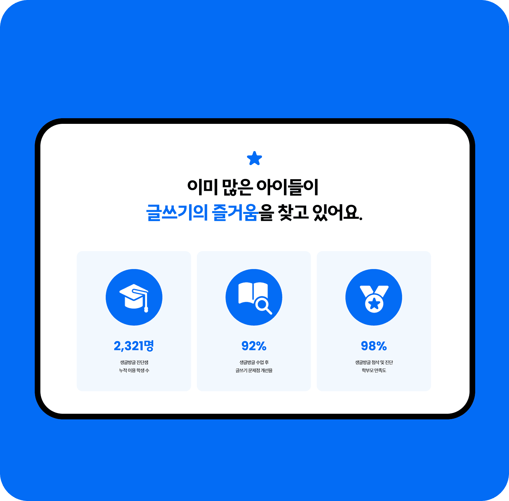
콘텐츠는 둥근 테두리의 카드형 박스와 벤토 그리드 레이아웃으로 구성하여 정보 위계를 명확히 하면서도 부드럽고 친근한 시각 흐름을 유도했습니다.
또한, 가운데 정렬 레이아웃을 적용해 주요 메시지와 CTA에 시선을 집중시켰으며, 문장형 타이틀을 통해 브랜드의 진정성과 신뢰감을 전달합니다.
콘텐츠는 둥근 테두리의 카드형 박스와 벤토 그리드 레이아웃으로 구성하여 정보 위계를 명확히 하면서도 부드럽고 친근한 시각 흐름을 유도했습니다. 또한, 가운데 정렬 레이아웃을 적용해 주요 메시지와 CTA에 시선을 집중시켰으며, 문장형 타이틀을 통해 브랜드의 진정성과 신뢰감을 전달합니다.
콘텐츠는 둥근 테두리의 카드형 박스와 벤토 그리드 레이아웃으로 구성하여 정보 위계를 명확히 하면서도 부드럽고 친근한 시각 흐름을 유도했습니다. 또한, 가운데 정렬 레이아웃을 적용해 주요 메시지와 CTA에 시선을 집중시켰으며, 문장형 타이틀을 통해 브랜드의 진정성과 신뢰감을 전달합니다.
The content consists of round-rimmed card boxes and bento grid layouts that clarify the information hierarchy while inducing a smooth and friendly visual flow.
In addition, the center alignment layout focuses attention on key messages and CTAs and conveys the authenticity and trustworthiness of the brand through sentence-type titles.
The content consists of round-rimmed card boxes and bento grid layouts that clarify the information hierarchy while inducing a smooth and friendly visual flow. In addition, the center alignment layout focuses attention on key messages and CTAs and conveys the authenticity and trustworthiness of the brand through sentence-type titles.
The content consists of round-rimmed card boxes and bento grid layouts that clarify the information hierarchy while inducing a smooth and friendly visual flow. In addition, the center alignment layout focuses attention on key messages and CTAs and conveys the authenticity and trustworthiness of the brand through sentence-type titles.

TYPOGRAHY
가독성이 높은 고딕 계열의 둥근 네모꼴 폰트를 사용하여 정보 전달의 명확성을 유지하면서도 브랜드의 전문성과 따뜻한 감성을 균형 있게 담아낼 수 있도록 설계했습니다.
가독성이 높은 고딕 계열의 둥근 네모꼴 폰트를 사용하여 정보 전달의 명확성을 유지하면서도 브랜드의 전문성과 따뜻한 감성을 균형 있게 담아낼 수 있도록 설계했습니다.
We used a highly legible rounded sans-serif typeface to ensure clear information delivery while balancing the brand’s professionalism with a warm and approachable sensibility.
We used a highly legible rounded sans-serif typeface to ensure clear information delivery while balancing the brand’s professionalism with a warm and approachable sensibility.


COLOR
비비드한 컬러를 활용하여 학부모 타깃에게는 밝고 안정감 있는 분위기를 전달하고 서비스에 대한 긍정적이며 신뢰감 있는 이미지를 형성할 수 있도록 구성하였습니다.
또한, 아이들에게는 친근하고 경쾌한 컬러 무드를 적용하여 브랜드를 접하는 과정 자체가 즐겁고 편안하게 느껴질 수 있도록 설계하였습니다.
비비드한 컬러를 활용하여 학부모 타깃에게는 밝고 안정감 있는 분위기를 전달하고 서비스에 대한 긍정적이며 신뢰감 있는 이미지를 형성할 수 있도록 구성하였습니다. 또한, 아이들에게는 친근하고 경쾌한 컬러 무드를 적용하여 브랜드를 접하는 과정 자체가 즐겁고 편안하게 느껴질 수 있도록 설계하였습니다.
비비드한 컬러를 활용하여 학부모 타깃에게는 밝고 안정감 있는 분위기를 전달하고 서비스에 대한 긍정적이며 신뢰감 있는 이미지를 형성할 수 있도록 구성하였습니다. 또한, 아이들에게는 친근하고 경쾌한 컬러 무드를 적용하여 브랜드를 접하는 과정 자체가 즐겁고 편안하게 느껴질 수 있도록 설계하였습니다.
Vivid colors were used to create a bright and reassuring atmosphere for parents, while also establishing a positive and trustworthy image of the service.
In addition, a friendly and lively color mood was applied for children so that the experience of interacting with the brand itself feels enjoyable, approachable, and comfortable.
Vivid colors were used to create a bright and reassuring atmosphere for parents, while also establishing a positive and trustworthy image of the service. In addition, a friendly and lively color mood was applied for children so that the experience of interacting with the brand itself feels enjoyable, approachable, and comfortable.
Vivid colors were used to create a bright and reassuring atmosphere for parents, while also establishing a positive and trustworthy image of the service. In addition, a friendly and lively color mood was applied for children so that the experience of interacting with the brand itself feels enjoyable, approachable, and comfortable.


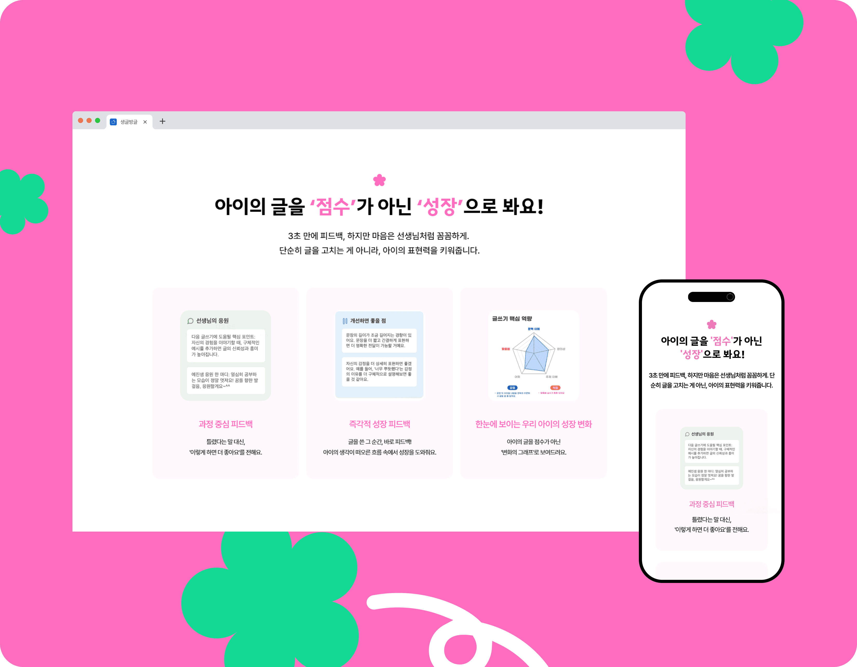
main page STRATEGY
정보 중심의 콘텐츠 구조 속에서도 사용 흐름이 단조롭게 느껴지지 않도록 메인 페이지의 각 섹션별로 아이콘 그래픽을 활용해 시각적 리듬감을 더했습니다.
사용자는 아이콘을 통해 콘텐츠의 성격을 직관적으로 인지할 수 있으며, 이는 가독성과 탐색 효율을 높이는 동시에 브랜드 특유의 친근하고 긍정적인 분위기를 자연스럽게 형성하는 요소로 작동합니다.
정보 중심의 콘텐츠 구조 속에서도 사용 흐름이 단조롭게 느껴지지 않도록 메인 페이지의 각 섹션별로 아이콘 그래픽을 활용해 시각적 리듬감을 더했습니다. 사용자는 아이콘을 통해 콘텐츠의 성격을 직관적으로 인지할 수 있으며, 이는 가독성과 탐색 효율을 높이는 동시에 브랜드 특유의 친근하고 긍정적인 분위기를 자연스럽게 형성하는 요소로 작동합니다.
정보 중심의 콘텐츠 구조 속에서도 사용 흐름이 단조롭게 느껴지지 않도록 메인 페이지의 각 섹션별로 아이콘 그래픽을 활용해 시각적 리듬감을 더했습니다. 사용자는 아이콘을 통해 콘텐츠의 성격을 직관적으로 인지할 수 있으며, 이는 가독성과 탐색 효율을 높이는 동시에 브랜드 특유의 친근하고 긍정적인 분위기를 자연스럽게 형성하는 요소로 작동합니다.
To prevent the user experience from feeling monotonous within an information-focused content structure, icon graphics were incorporated throughout each section of the main page
to create visual rhythm and enhance engagement. Through these icons, users can intuitively recognize the nature of each content section, improving readability and navigation efficiency
while naturally reinforcing the brand’s friendly and positive identity.
To prevent the user experience from feeling monotonous within an information-focused content structure, icon graphics were incorporated throughout each section of the main page to create visual rhythm and enhance engagement. Through these icons, users can intuitively recognize the nature of each content section, improving readability and navigation efficiency while naturally reinforcing the brand’s friendly and positive identity.
To prevent the user experience from feeling monotonous within an information-focused content structure, icon graphics were incorporated throughout each section of the main page to create visual rhythm and enhance engagement. Through these icons, users can intuitively recognize the nature of each content section, improving readability and navigation efficiency while naturally reinforcing the brand’s friendly and positive identity.


SMILEWRITING
SMILEWRITING
strategy
strategy
Web Design
Web Design
Responsive Design
Responsive Design
Mobile Optimization
Mobile Optimization
SEO Setup
SEO Setup
CREATIVE DIRECTOR
HUNYONG SEONG
PROJECT MANAGEMENT
HUNYONG SEONG
DESIGN DIRECTION
HUNYONG SEONG
WEB/MOBILE DESIGNER
YEJI YOON
CONTENT OPERATIONS
SEONGHOON KIM
©2026 PLUSMACH. All rights reserved.
©2026 PLUSMACH. All rights reserved.
OTHER
PROJECTS


OTHER
PROJECTS
Get in touch
플러스마하 | 대표: 성훈용 | 사업자등록번호: 591-29-00813
주소: 서울특별시 마포구 독막로9길 18 2, 3층 | E-mail: hello@plusmach.com
Get in touch
플러스마하 | 대표: 성훈용 | 사업자등록번호: 591-29-00813
주소: 서울특별시 마포구 독막로9길 18 2, 3층 | E-mail: hello@plusmach.com
MADE BY PLUSMACH
all rights reserved.