renaitre clinic


Renaître Clinic
Brand strategy
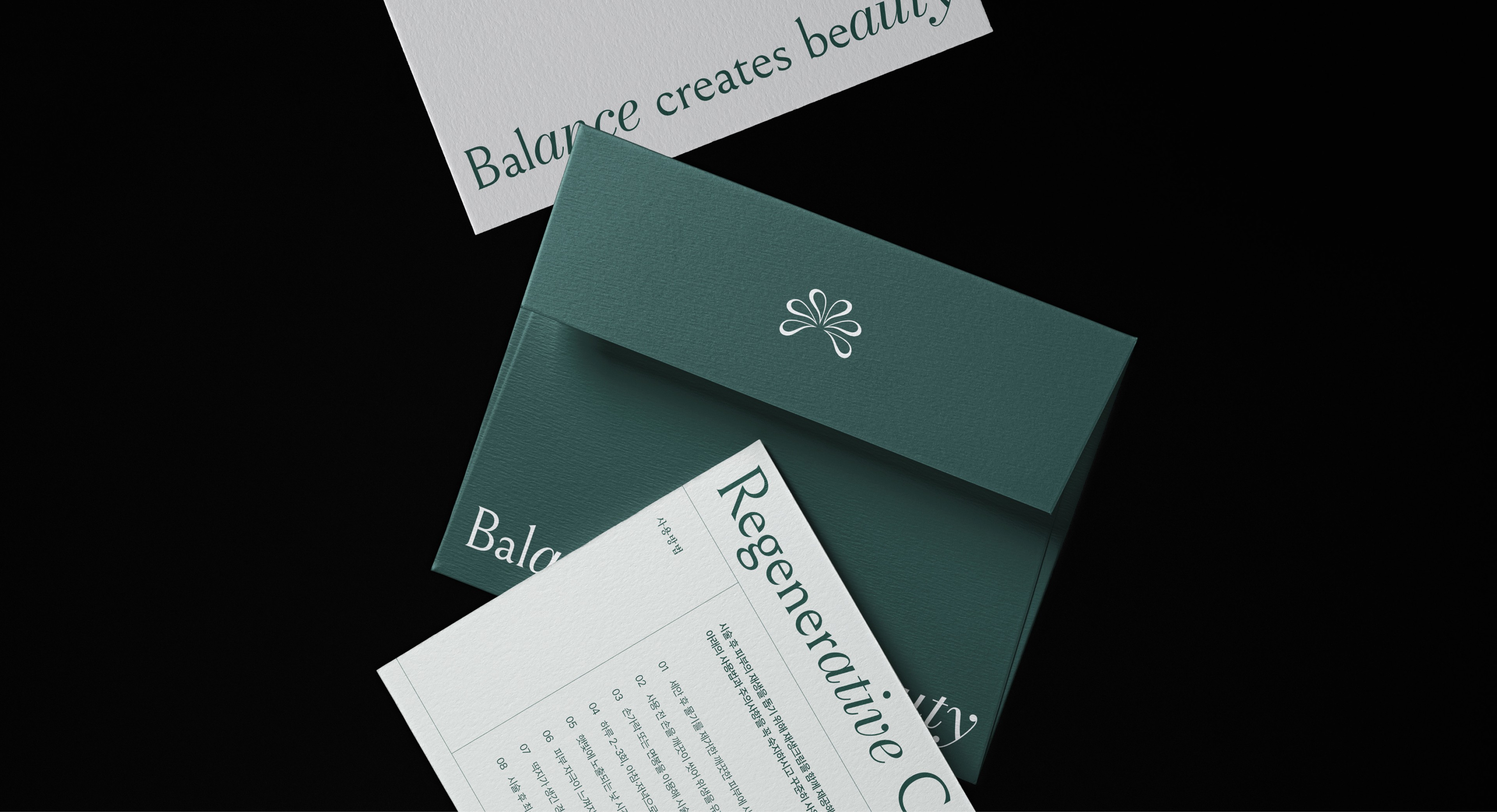
Brand Identity
style guide
graphic design
application design
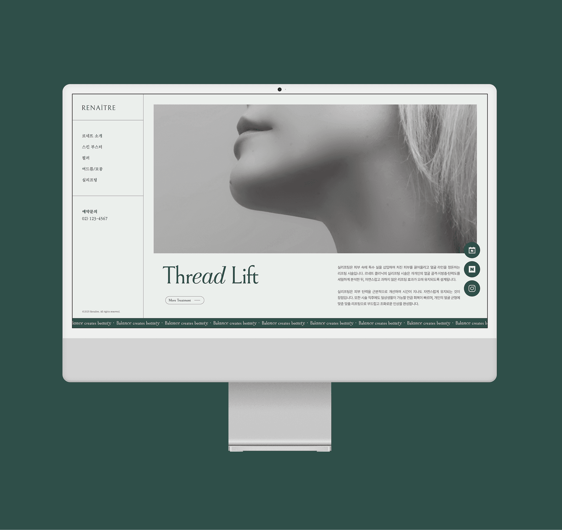
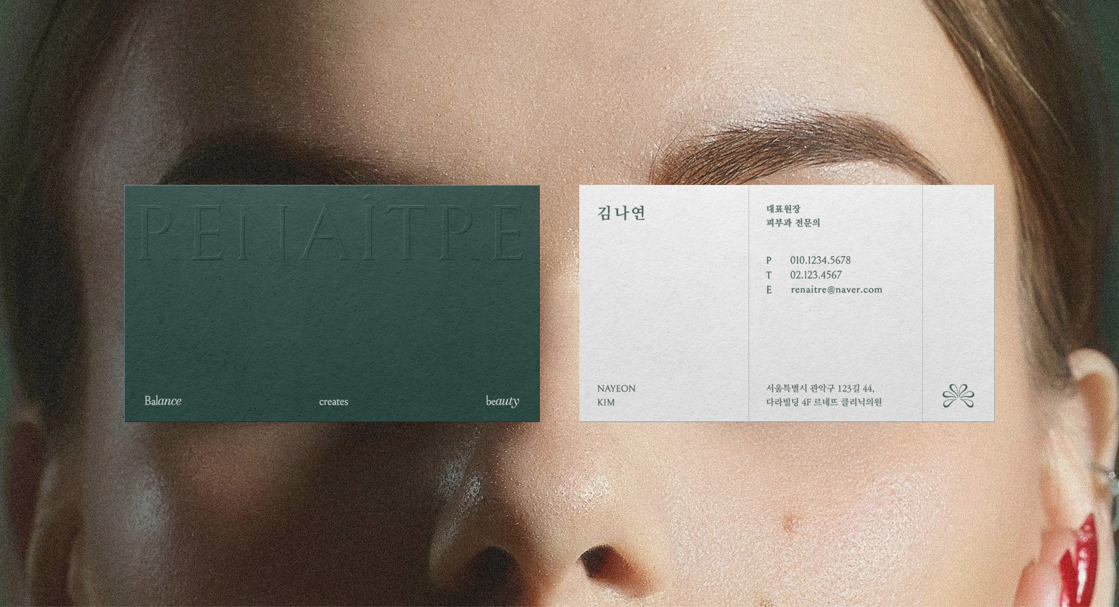
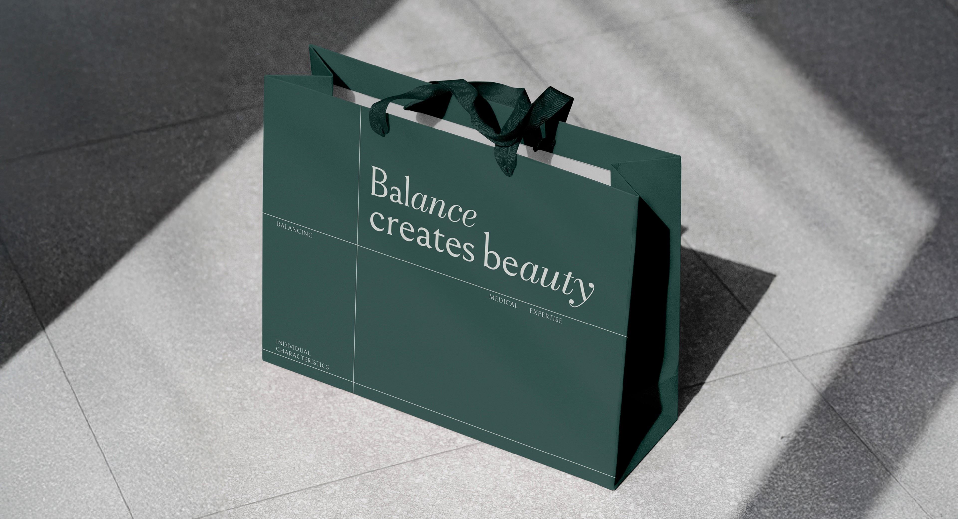
Renaître Clinic is a premium dermatology clinic led by a dermatologist, offering a distinctive approach that prioritizes restoring the skin’s natural condition rather than relying on excessive cosmetic procedures.
The brand values long-term, sustainable beauty over temporary changes, aiming to deliver a holistic experience where expertise and emotional sensitivity come together seamlessly.
In this project, the focus was on building a visual language that reflects both the professionalism expected from a medical service brand and the emotional trust that Renaître Clinic seeks to inspire. Our goal was to ensure that the brand’s unique philosophy and tone are cohesively embedded across the entire design system.
르네뜨 클리닉은 피부과 전문의가 운영하는 프리미엄 피부 클리닉으로 과도한 미용 시술이 아닌 피부 본연의 컨디션 회복에 중점을 둔 차별화된 서비스를 제공합니다.
일시적인 변화보다 지속 가능한 아름다움에 가치를 두며, 의료적 전문성과 감성적 경험이 조화롭게 어우러지는 브랜드 경험을 지향합니다.
본 프로젝트에서는 르네뜨 클리닉이 의료 서비스 브랜드로서 갖춰야 할 전문성과 감성적으로도신뢰감을 줄 수 있는 시각적 언어를 구축하는 데 중점을 두었습니다. 브랜드만의 철학과 태도가 디자인 전반에 자연스럽게 녹아들 수 있도록 전개하였습니다.
Brand feature
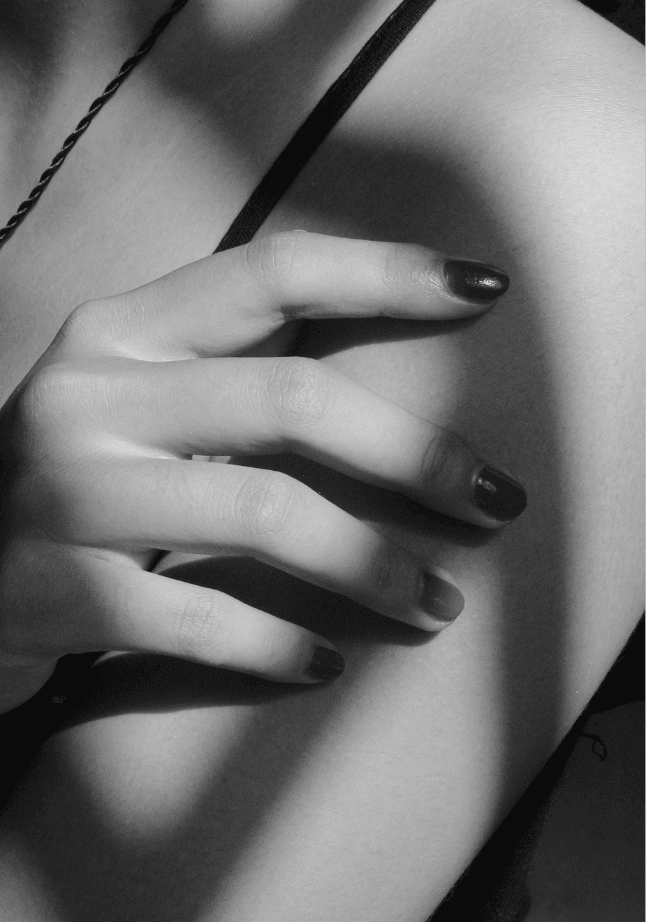
sensitive
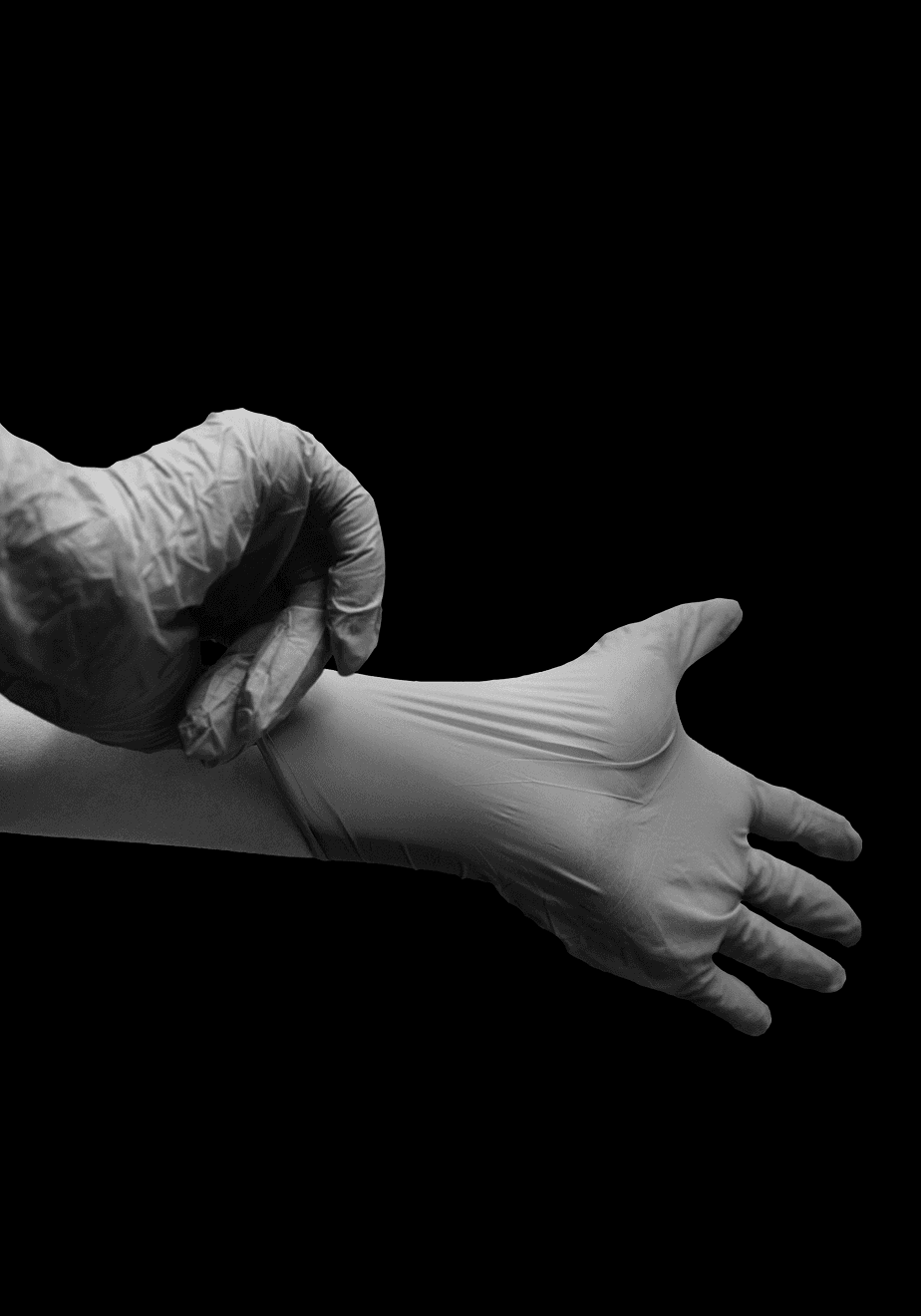
expertise

Sustainable
Brand Essence
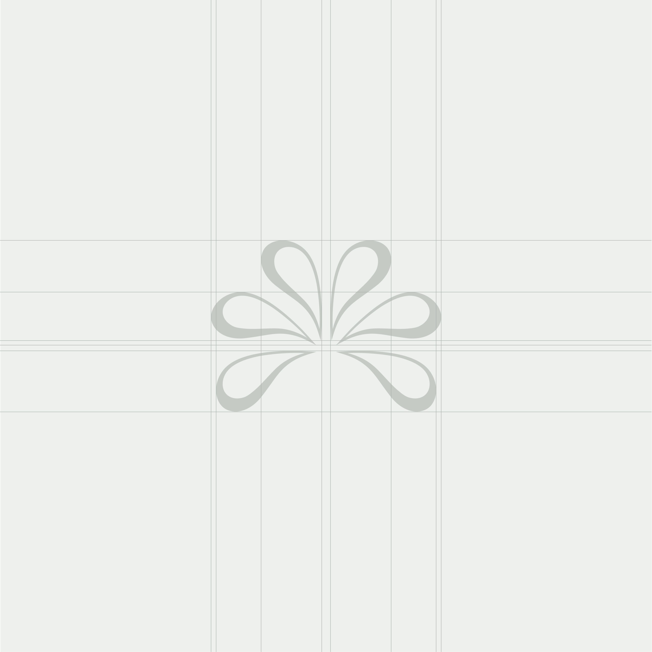
brand symbol

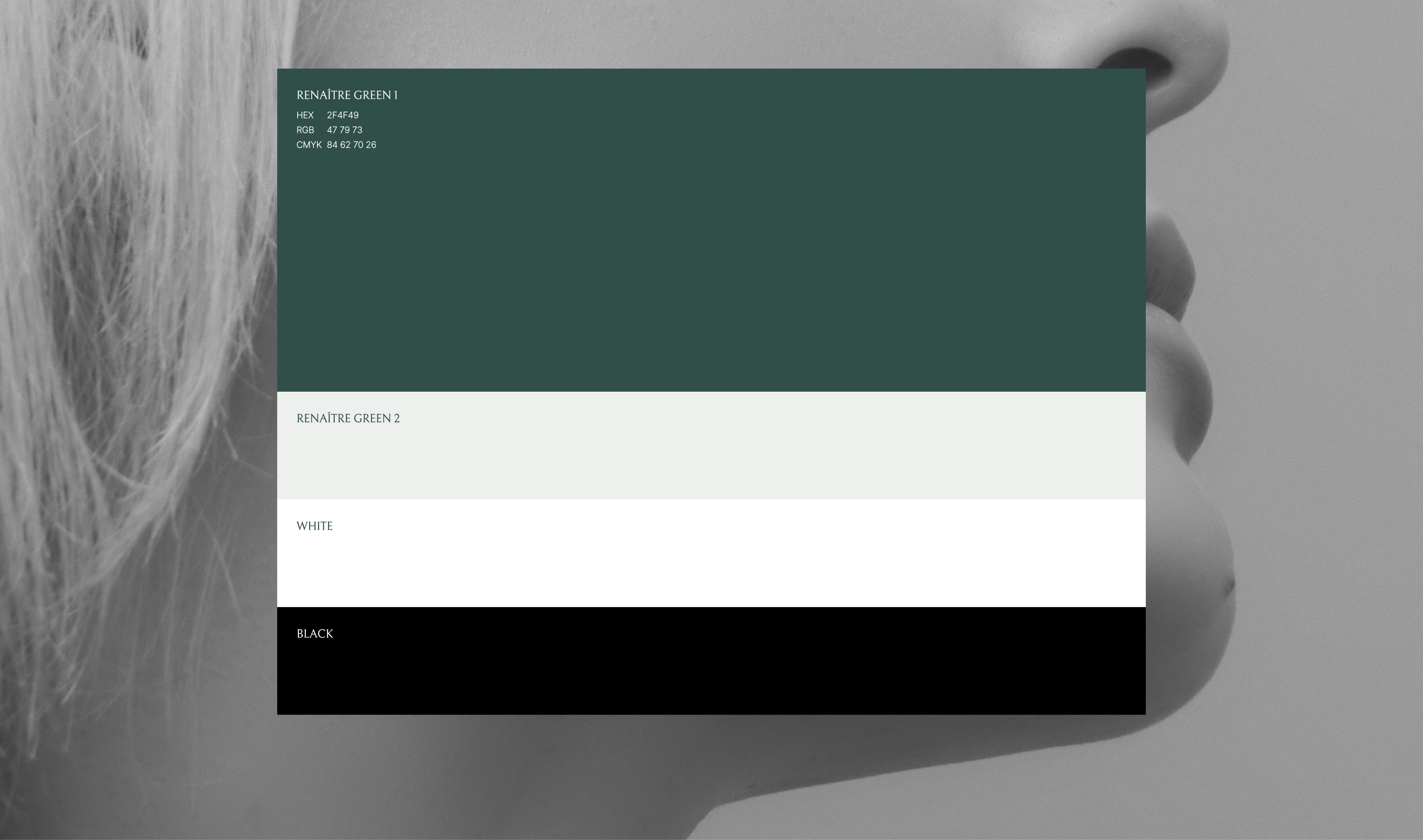
color system
TYPOGRAPHY


GRID SYSTEM
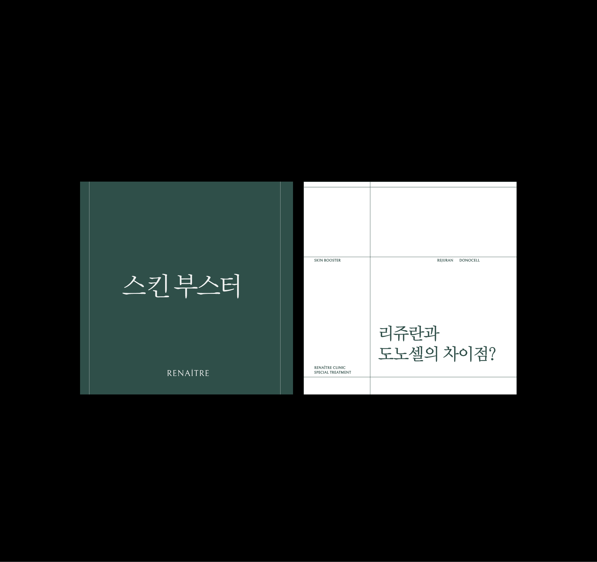
Type A
Type B
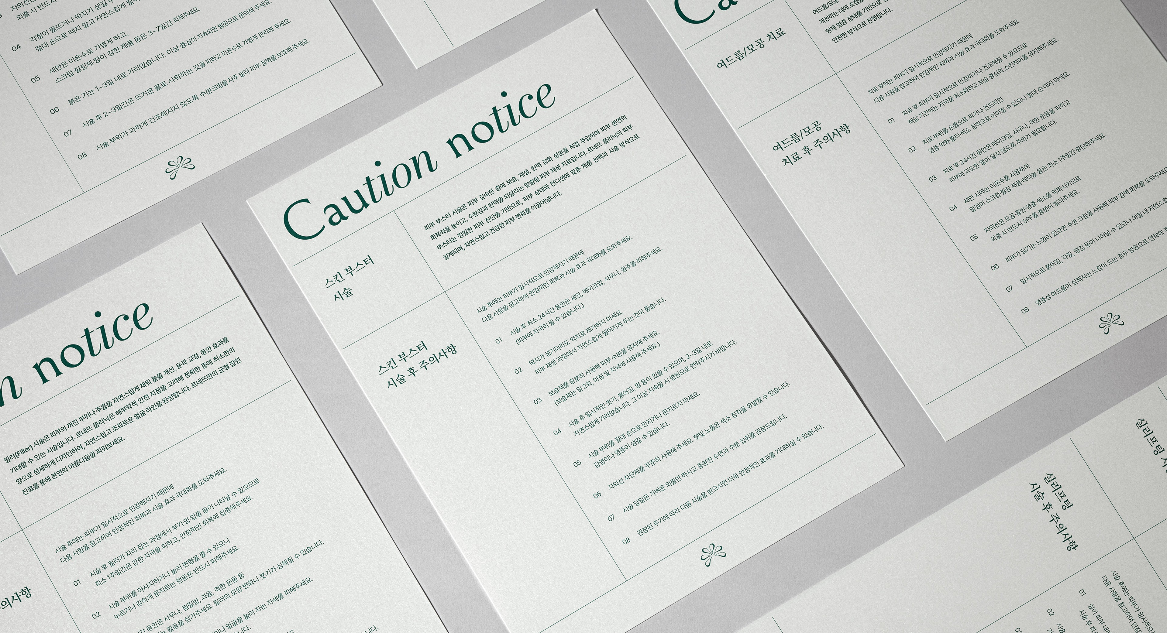
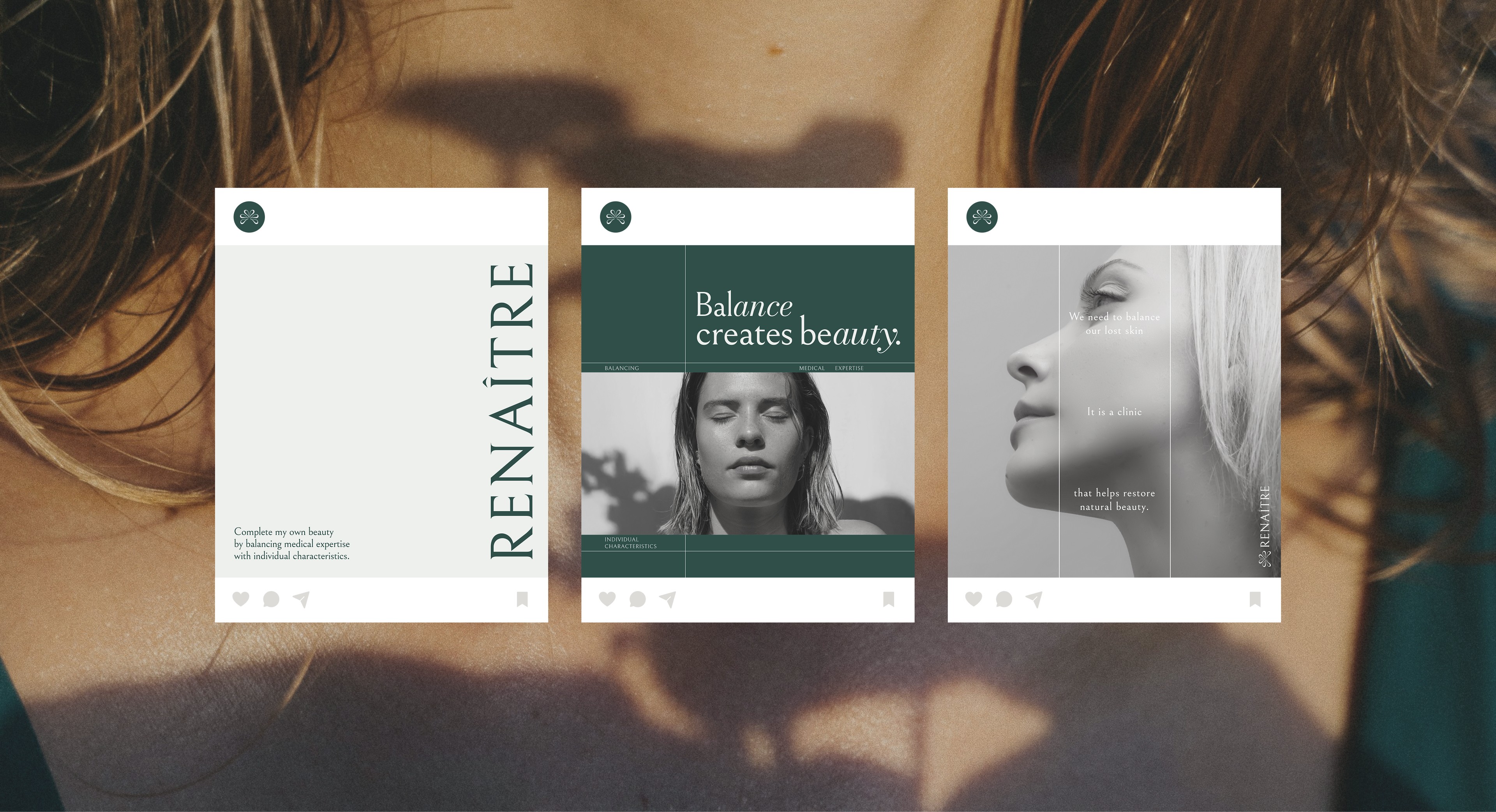
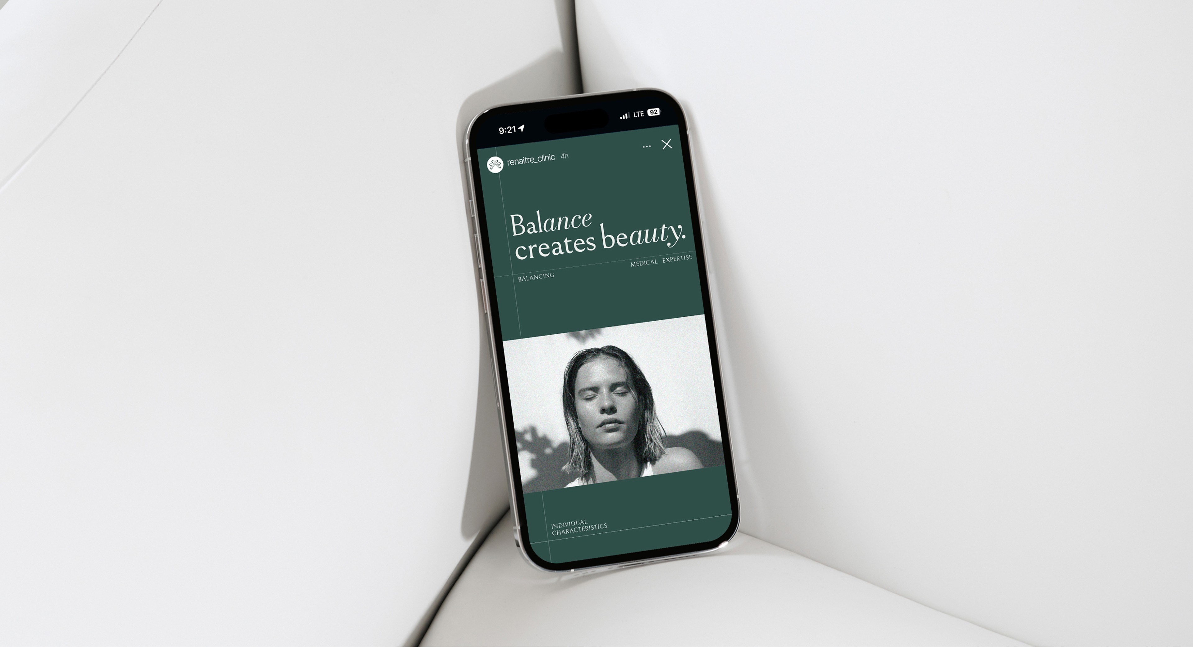
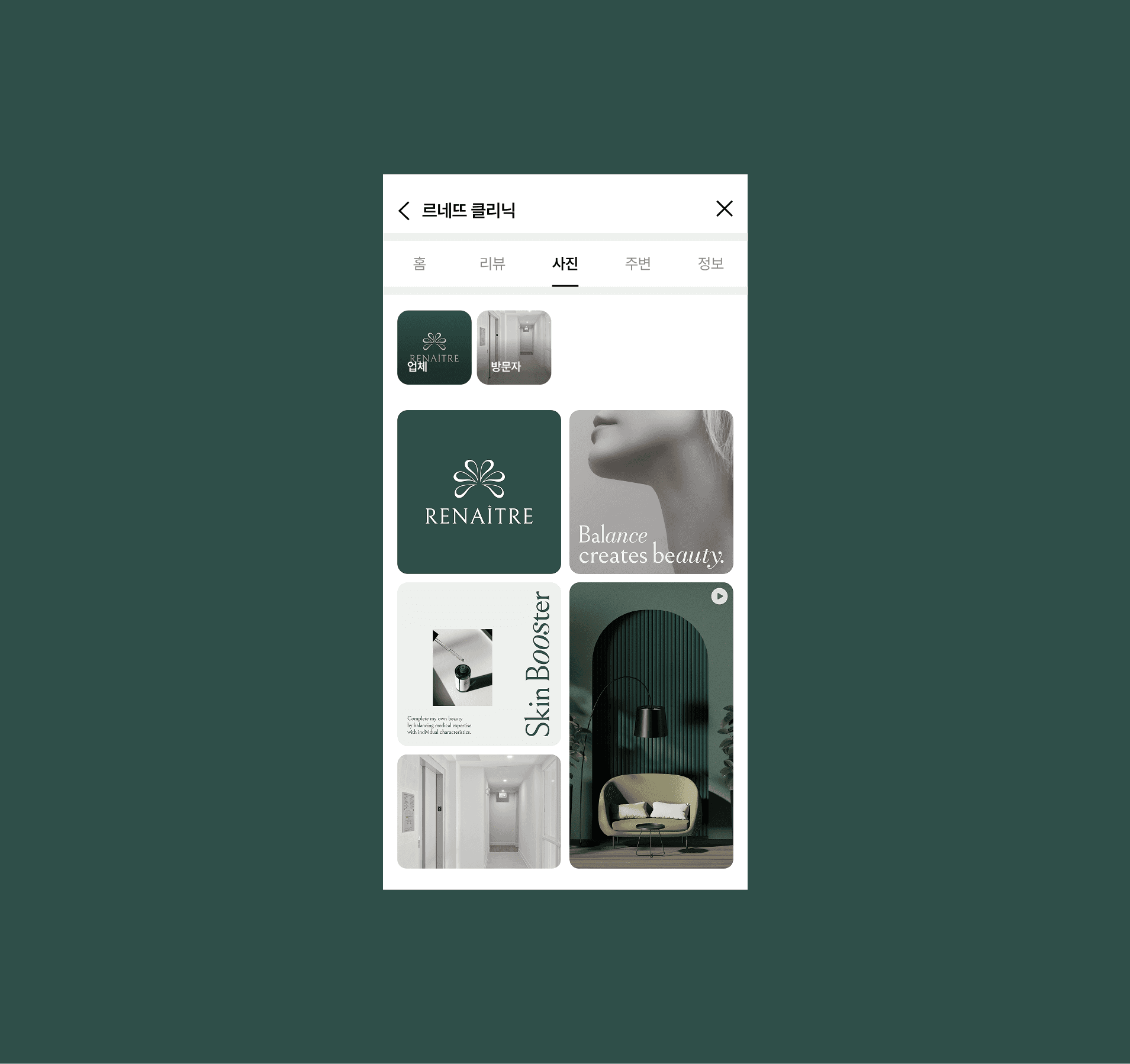
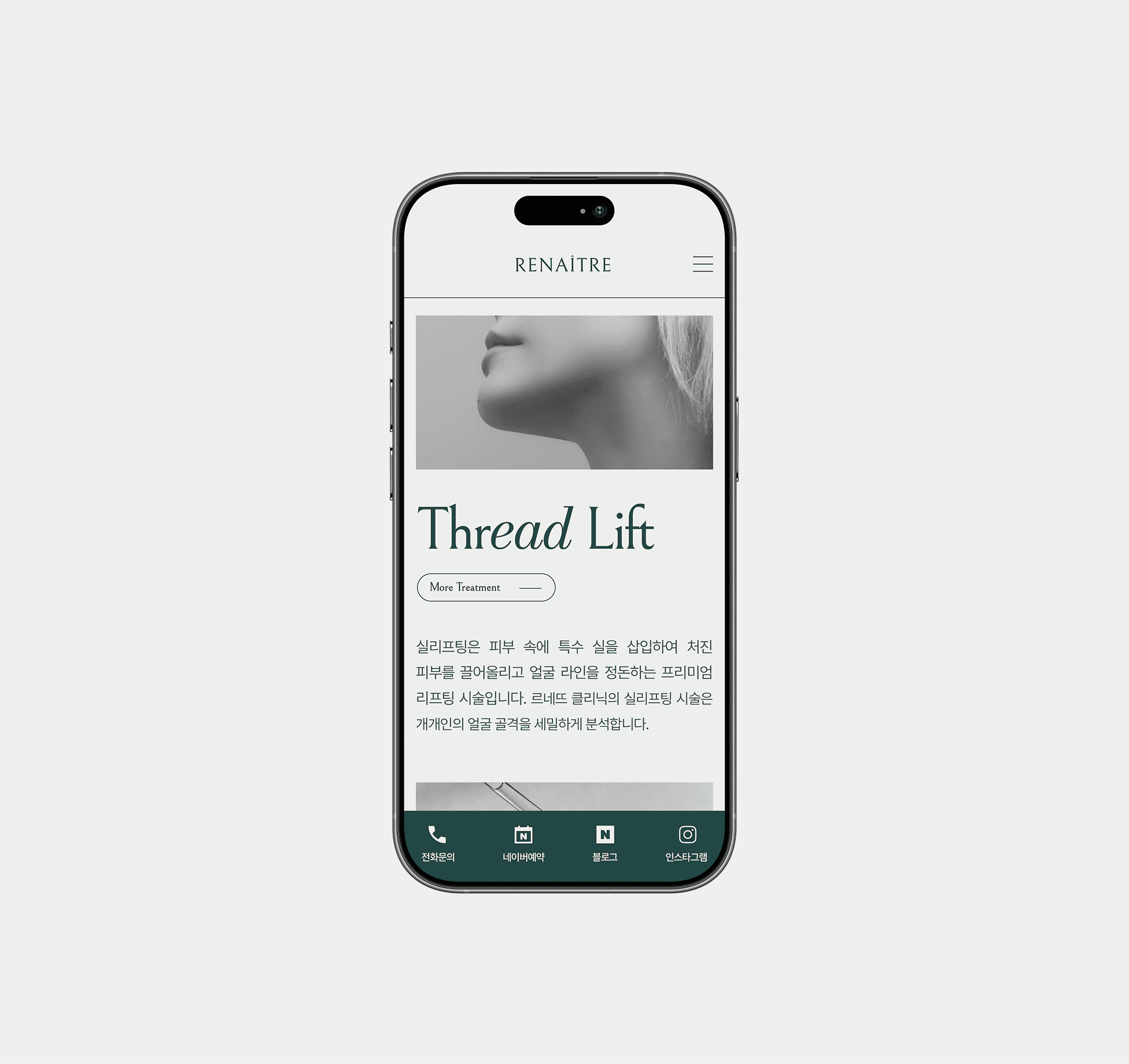
APPLICATION

©2025 PLUSMACH. All rights reserved.


MADE BY PLUSMACH
all rights reserved.